Fundle began with no logo, no shelf, no memory. A naming exercise had landed on a word with fun already inside it — the design job was to make that fun visible.
Our first observation shaped everything: a toy brand has to be understood before it is read.
So every design decision was tested at a distance, at a glance, and in a child's hands.
Recognition comes
before reading.
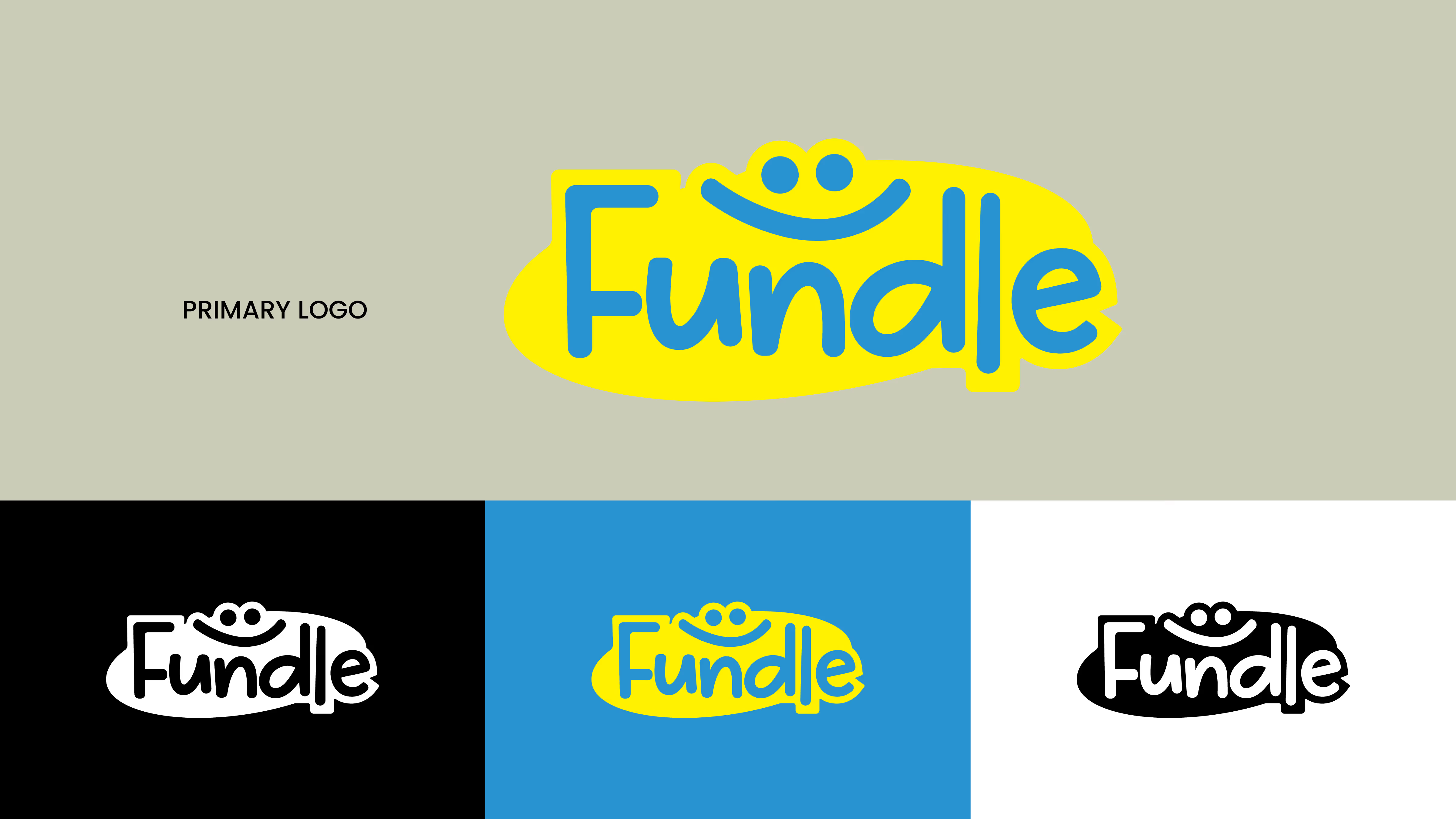
The wordmark is set in soft, rounded lowercase forms — not a sharp corner anywhere in the logotype. Above the letters sit two dots and a curve.
The logo idea ✦
The mark was drawn in three lockups — on black, on blue, and in outline — so it could sit on any box, bag, or screen without a redraw. One face, every surface.
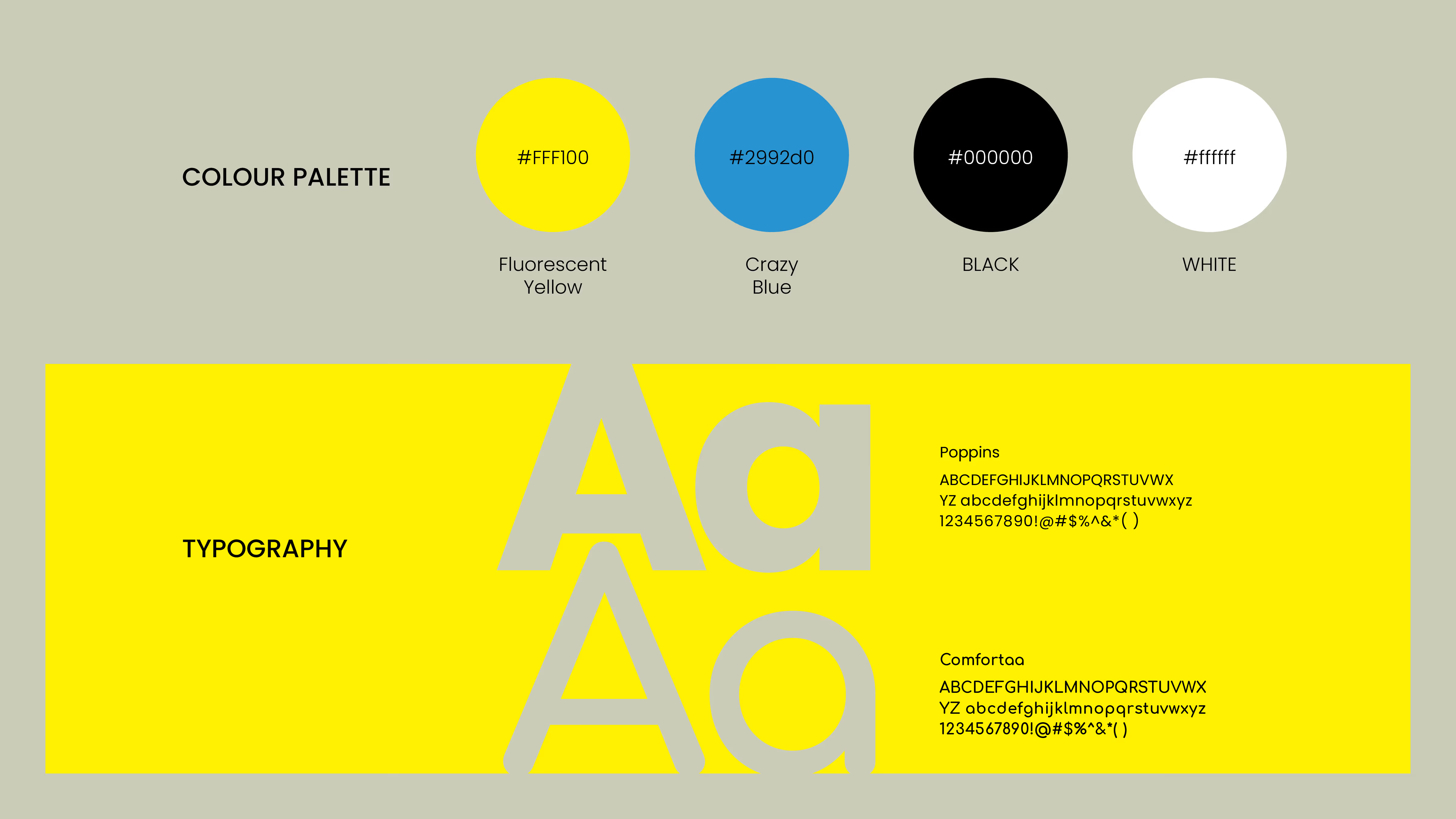
Fluorescent Yellow to be found across the aisle. Crazy Blue to hold the mark. Black and white to keep the pair honest.
Type followed the logo's geometry — round, open, friendly — one family for headlines, one for the small print a parent reads.
A palette a child can spot, and a system an adult can trust.
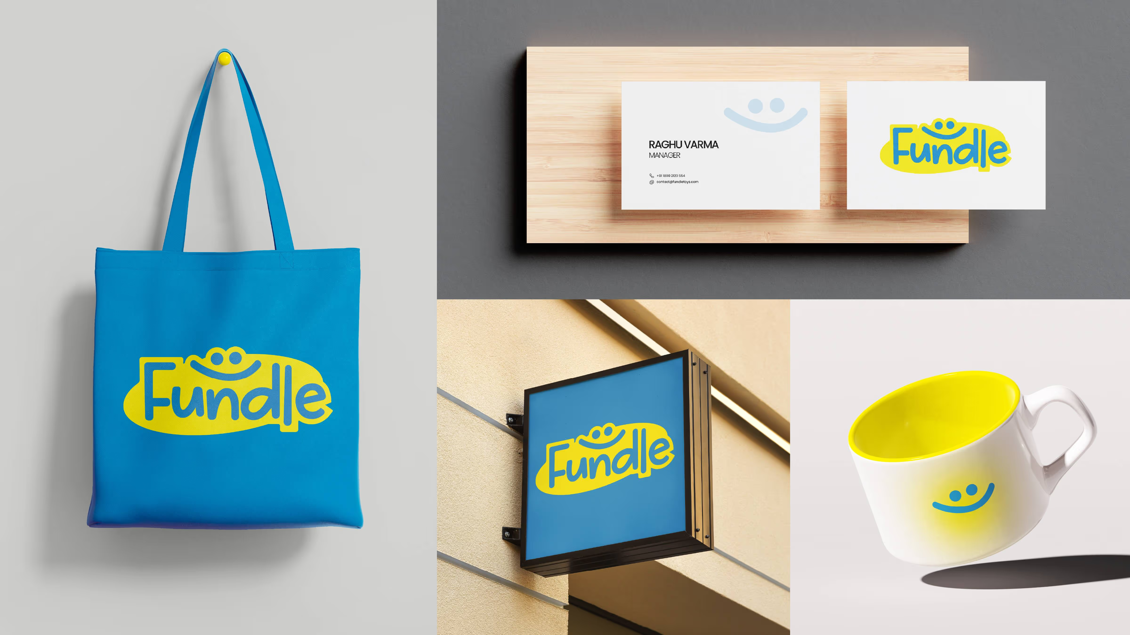
The system, applied · cards, tote, signage, mug
The foundation for every touchpoint — wordmark, smile motif, palette, and type, drawn once and locked as a kit.
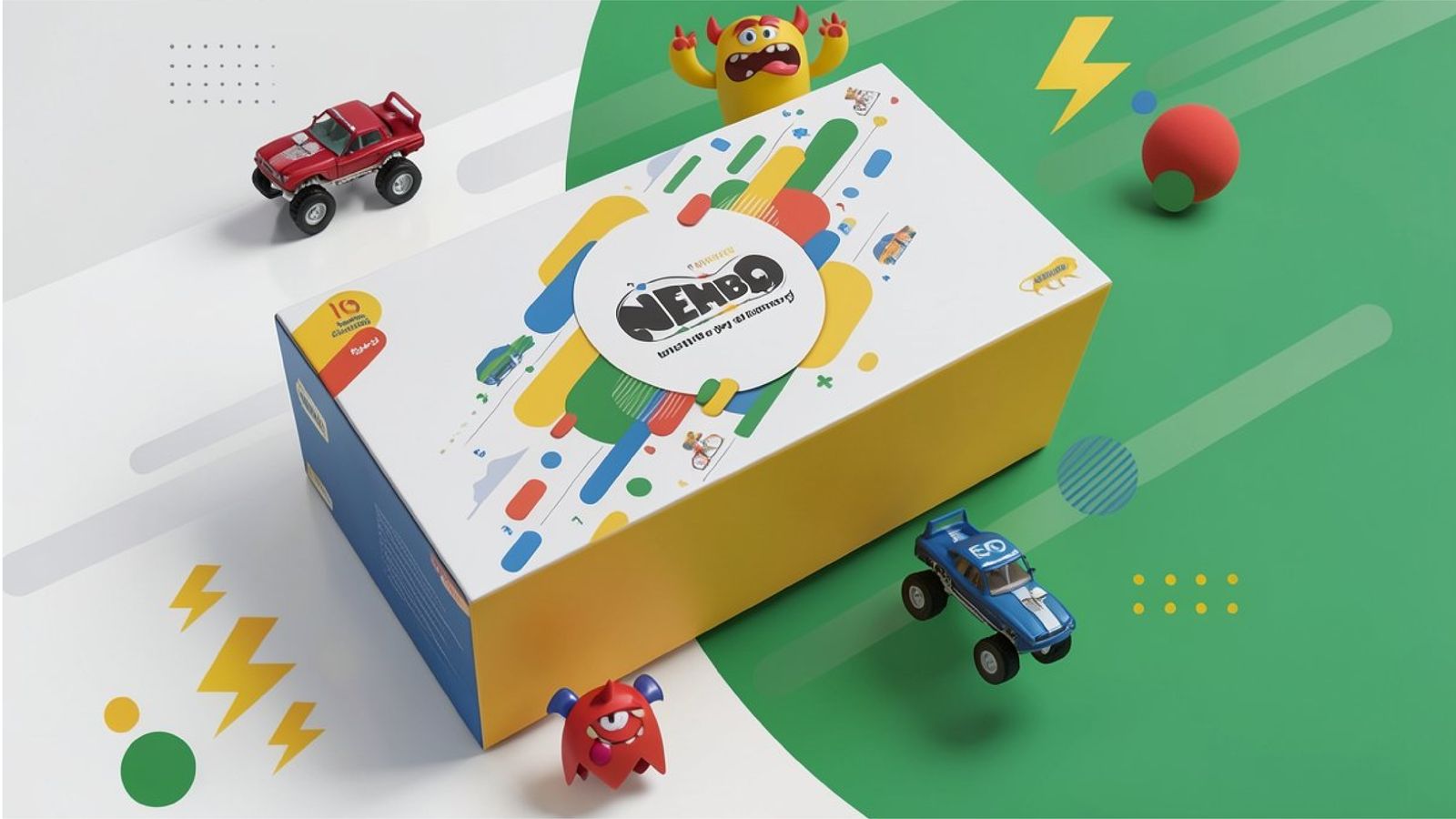
Packaging built to stand out in clutter and still feel familiar in a child's hands. Form, colour, and texture working as one system.
A brand built from zero — ready to grow every time a child reached for it.