Bru Exotica was moving into a new format — single-origin coffee, served cold, in a can. A shelf it had never stood on, next to energy drinks and iced teas that shout.
The design question was narrow and hard: how does a cup brand become a can brand without losing itself?
We started where the product starts. With a pour.
The name, the mark, the colour — everything is poured from the top down.
The design thoughtEvery decision on this project is visible on the can itself. The naming, the motif, and the palette were designed as one move, so the pack could explain the product faster than any line of copy.
The name came from the format. Can + coffee. Say it once and you know the product, the container, and the tone. The wordmark was then drawn to behave like the product — set vertically along the can, with letterforms that appear to melt slightly, as if the coffee is still settling.
The naming idea ✦
From there, the motif followed. A drip of coffee poured over the top of the can — drawn as a set of rounded strokes that read as liquid from a distance and as clean graphic shapes up close. One drawing, endlessly recolourable.
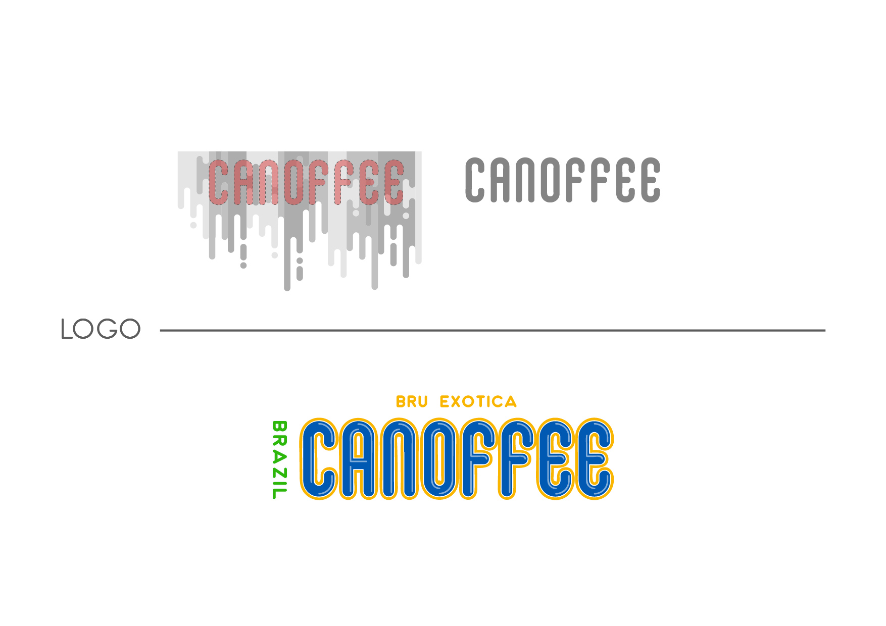
The logo construction · a mug, a melt, a mark
Each origin gets its colour from its flag.
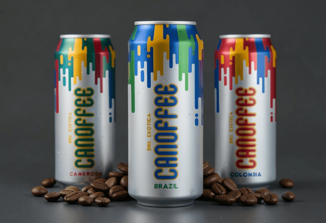
Brazil pours in blue, green, and yellow. Cameroon in green, red, and yellow. Colombia in red, blue, and gold. The drip motif stays identical — only the country changes the ink.
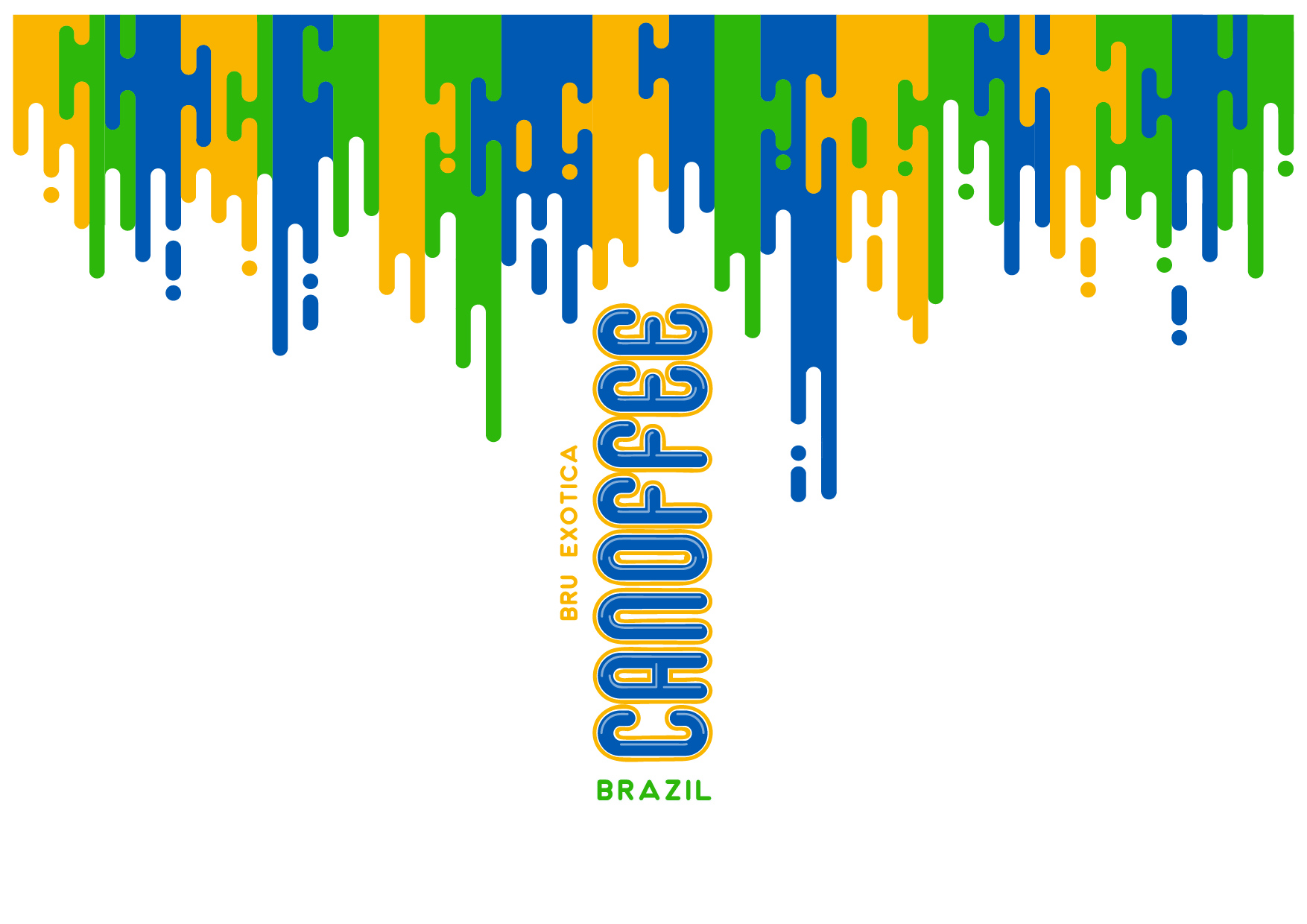 Origin · Brazil
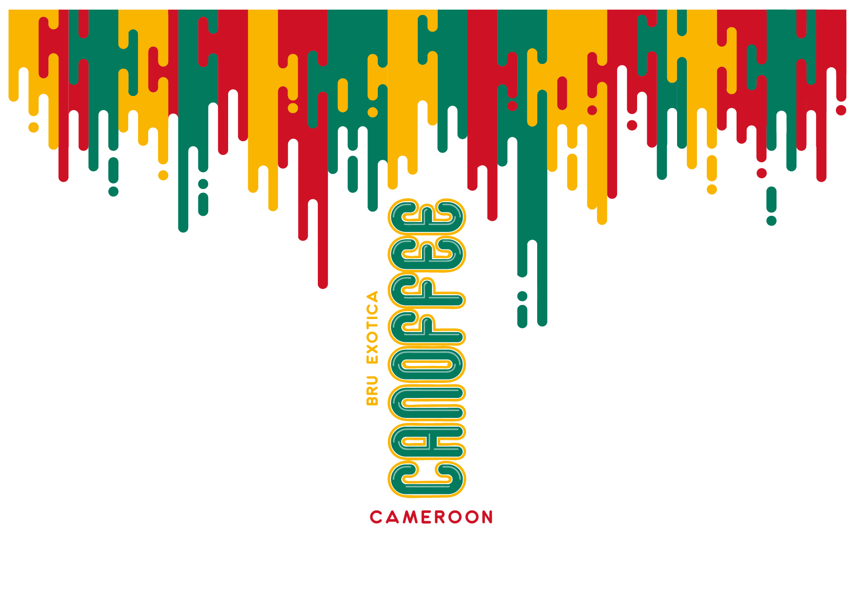 Origin · Cameroon
One drip drawing. One vertical wordmark. One bare silver can as the base.
Swap the flag, and a new variant designs itself.
The system scales to any origin Bru adds next — without a single new design decision.
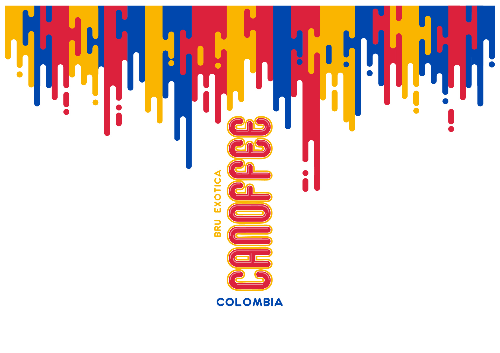
A pack is judged in hand. The drip wraps the shoulder of the can so the motif survives the curve, the grip, and the fridge door.
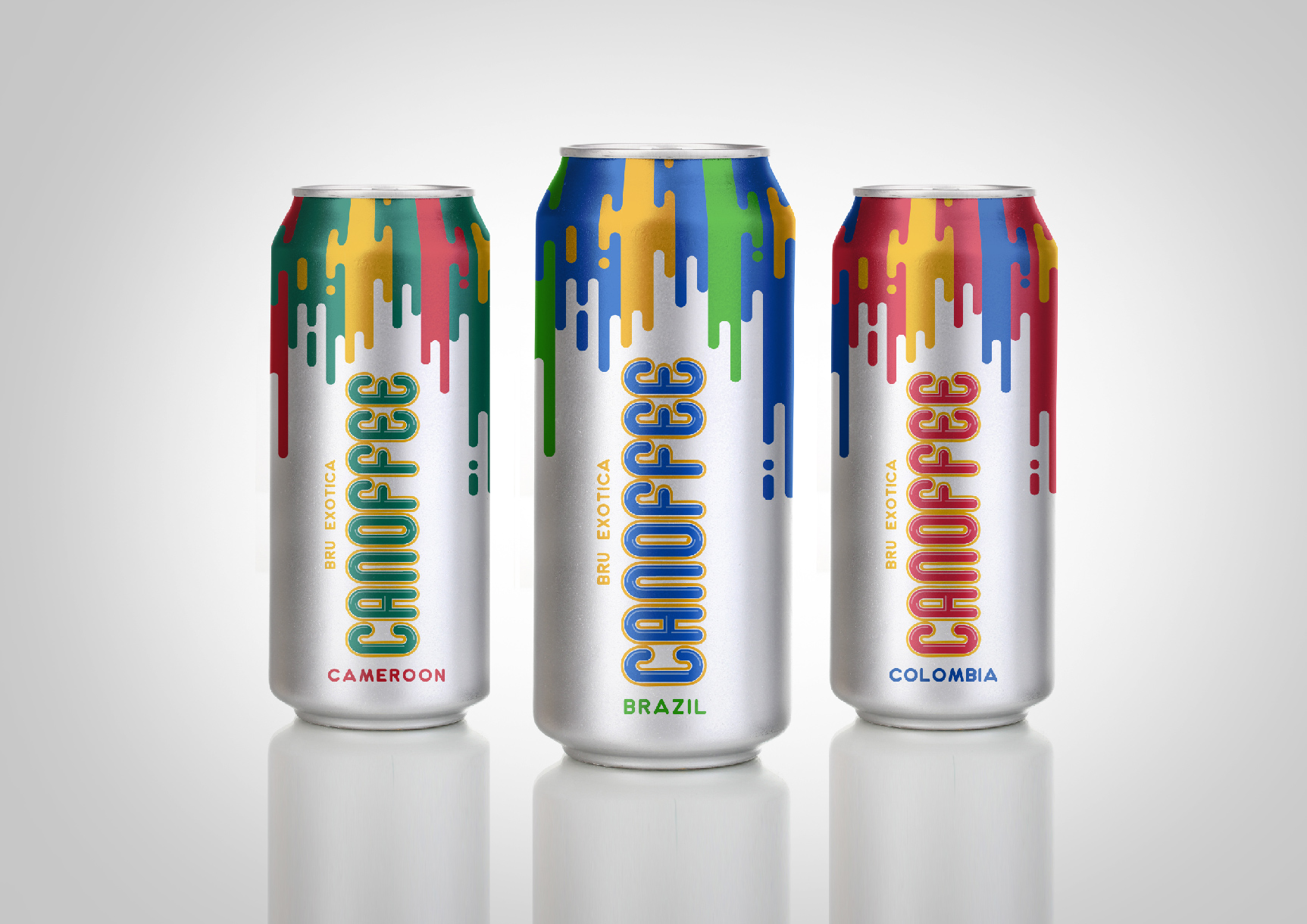
The range · three origins, one system
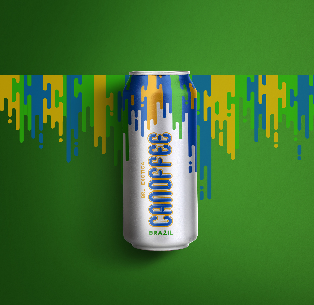 On shelf · Brazil
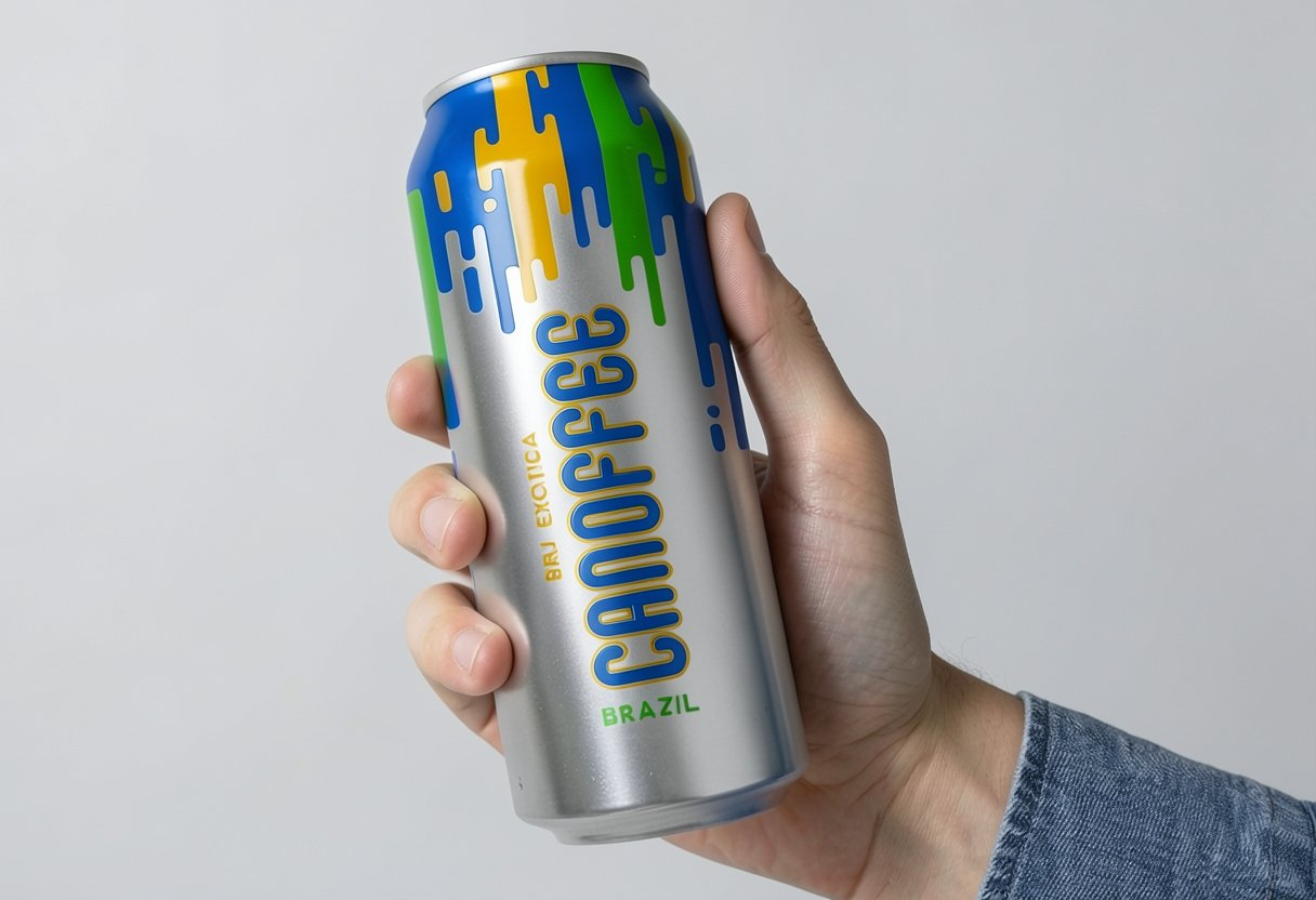 In hand · the drip up close
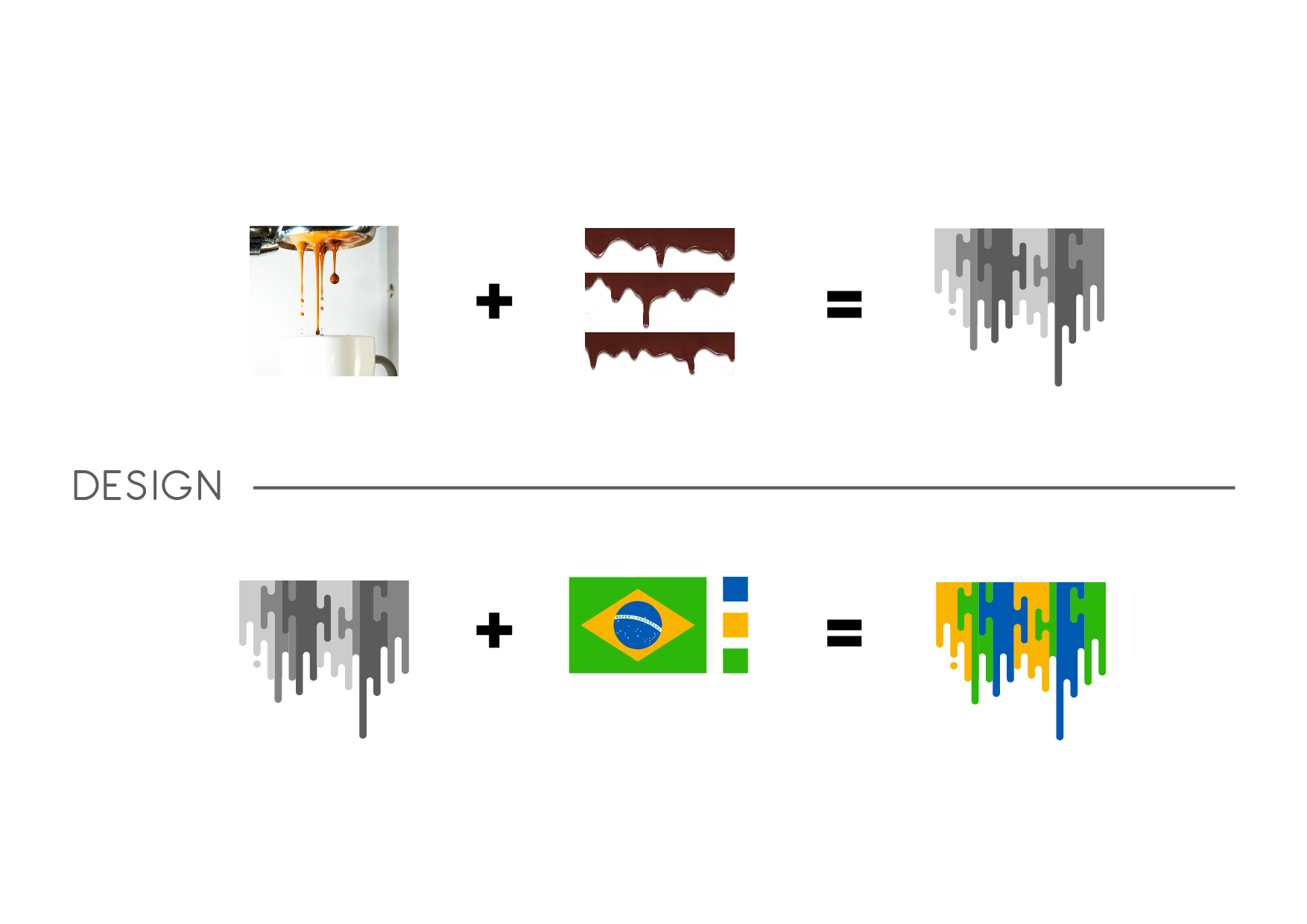
The working drawings · how the mark was built