Adda Games is a multi-gaming platform — poker, rummy, more titles arriving every quarter. Each game had its own look, and the platform had none.
The design brief was a master-brand problem: one identity elastic enough to hold every game, and disciplined enough to be recognised in a single frame.
So we designed the system before we designed a single asset.
Design the grammar,
and every game speaks the same language.
If every game under Adda shares one mark, one palette, and one photographic treatment, each new title borrows recognition from the last — without a redesign.
The mark is a single lowercase a, drawn as a rounded counter — part game piece, part location pin, because adda means the place where people gather. It reads at app-icon size and at billboard size without change.
The identity idea ✦
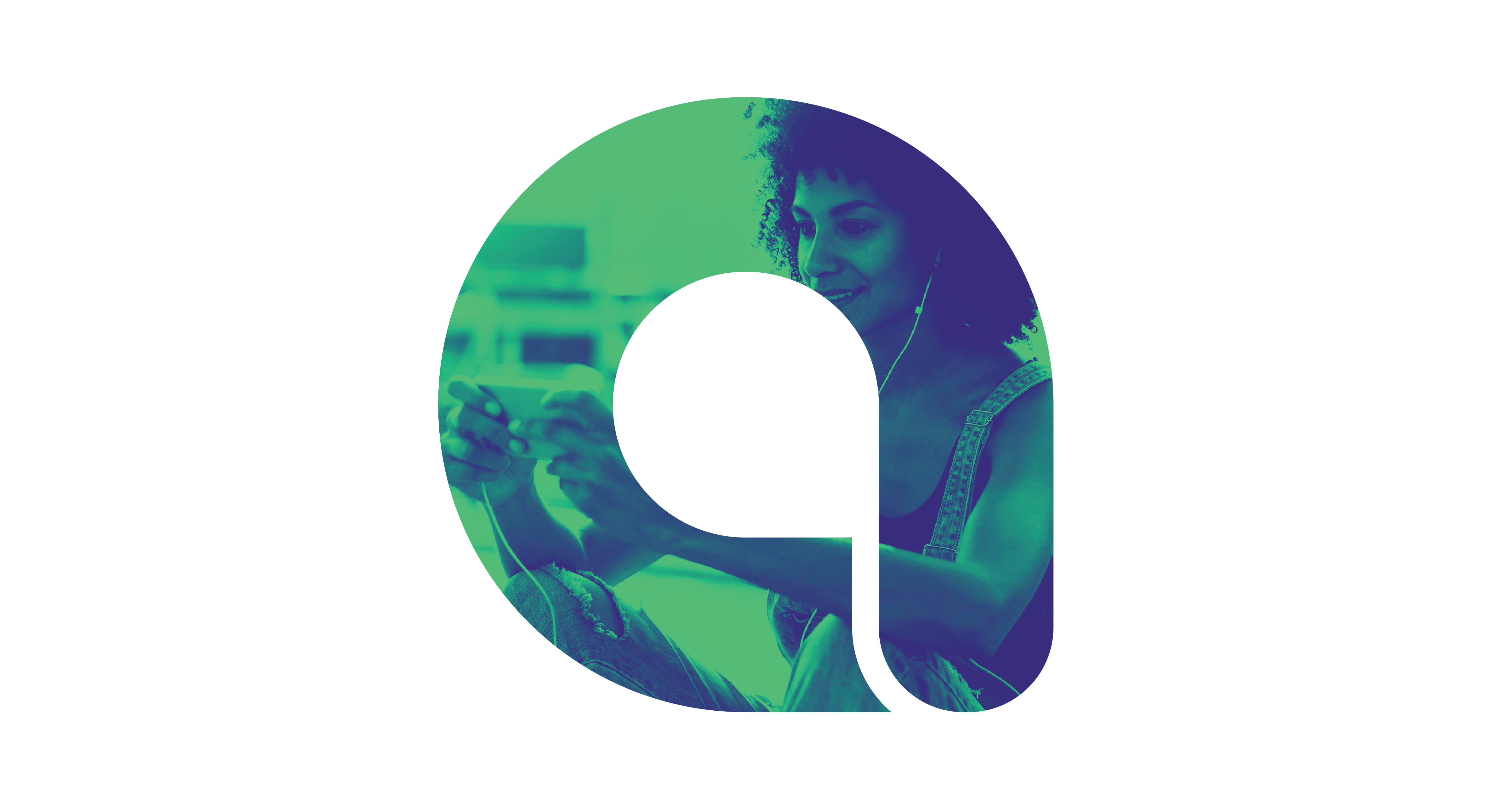
The mark · a game piece, a pin, a letter
The kit has four parts. A mint-on-charcoal palette that glows in dark UI. A rounded typeface that echoes the mark's geometry. A duotone photo treatment that pulls any player image into brand colour. And the counter mark, always in the corner.
Every asset is a recombination of those four parts.
That is what lets poker, rummy, and whatever comes next sit in the same feed and read as one platform.

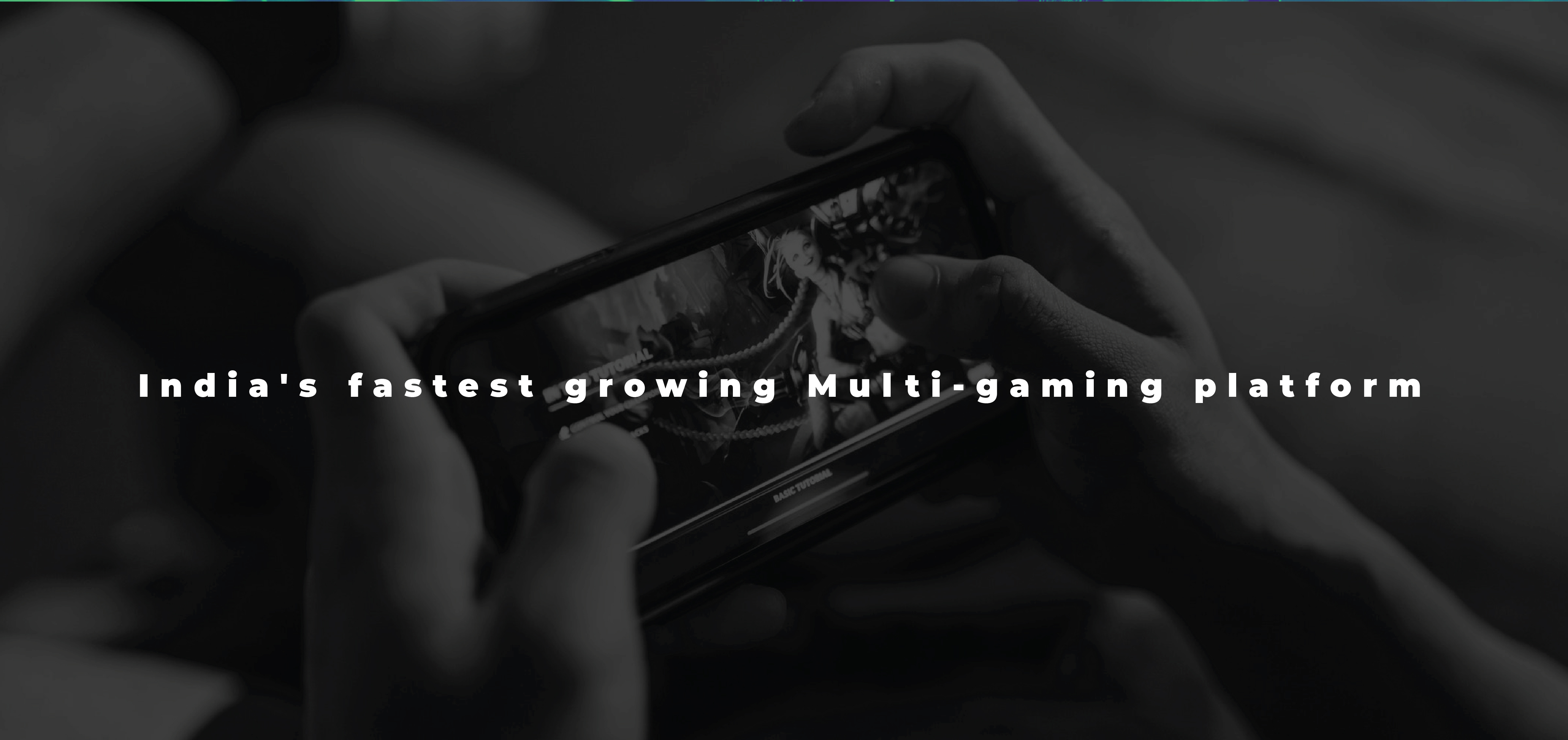
The system · across contexts
The proof of a master brand is repetition without fatigue. App UI, banners, merch, tournament screens — each built from the same four parts, none needing a new decision.
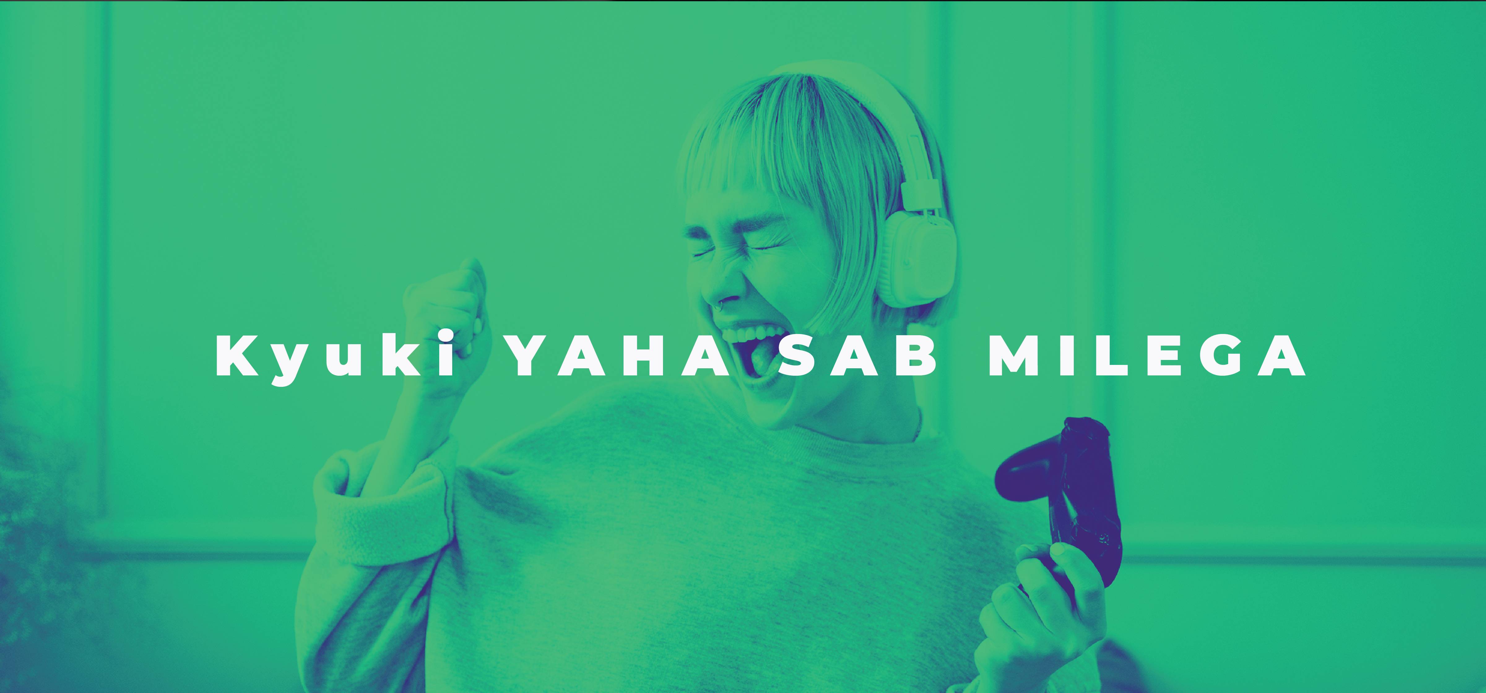
The duotone treatment · any photo, two inks
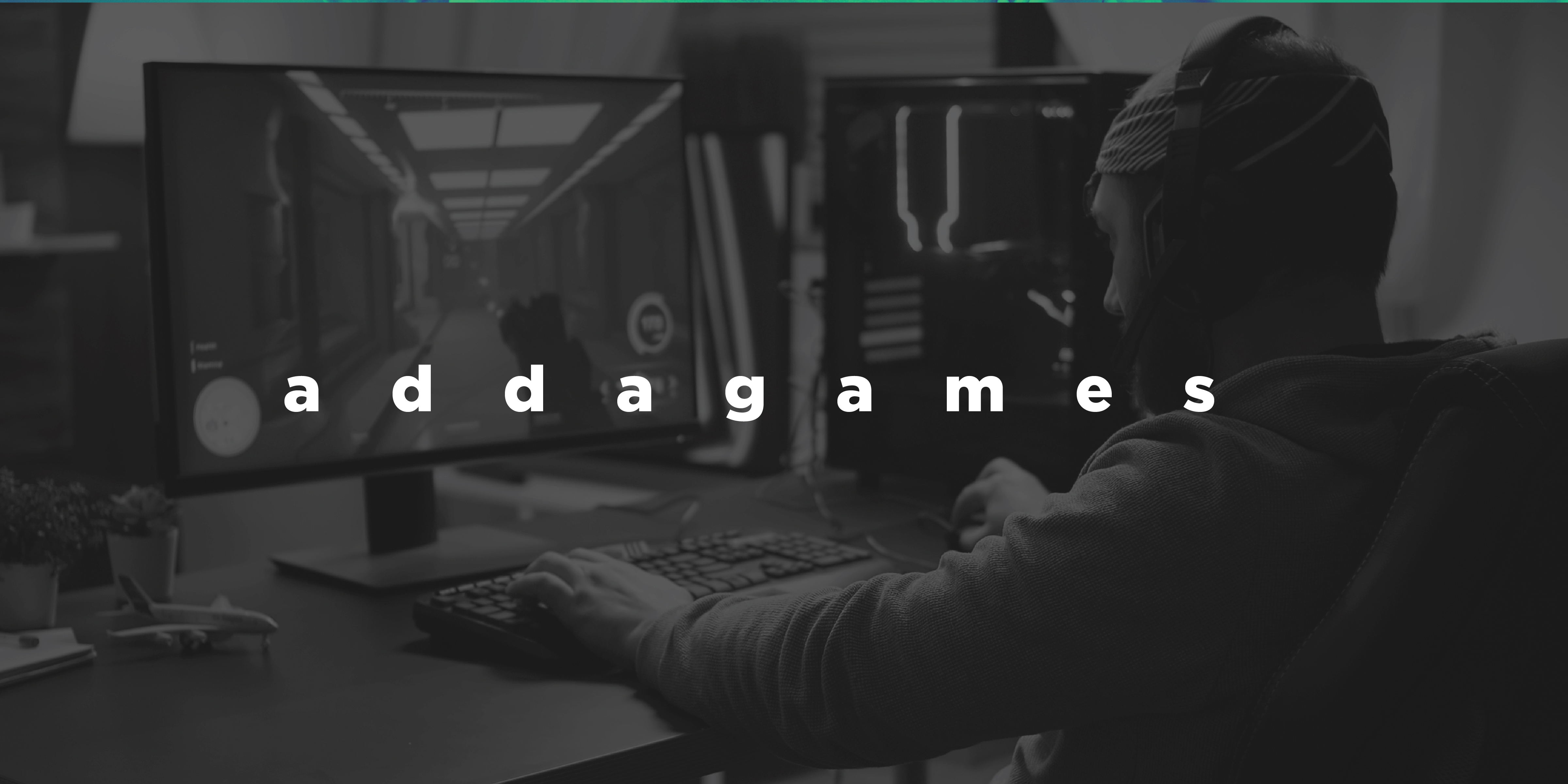
The wordmark · lowercase, letterspaced, calm
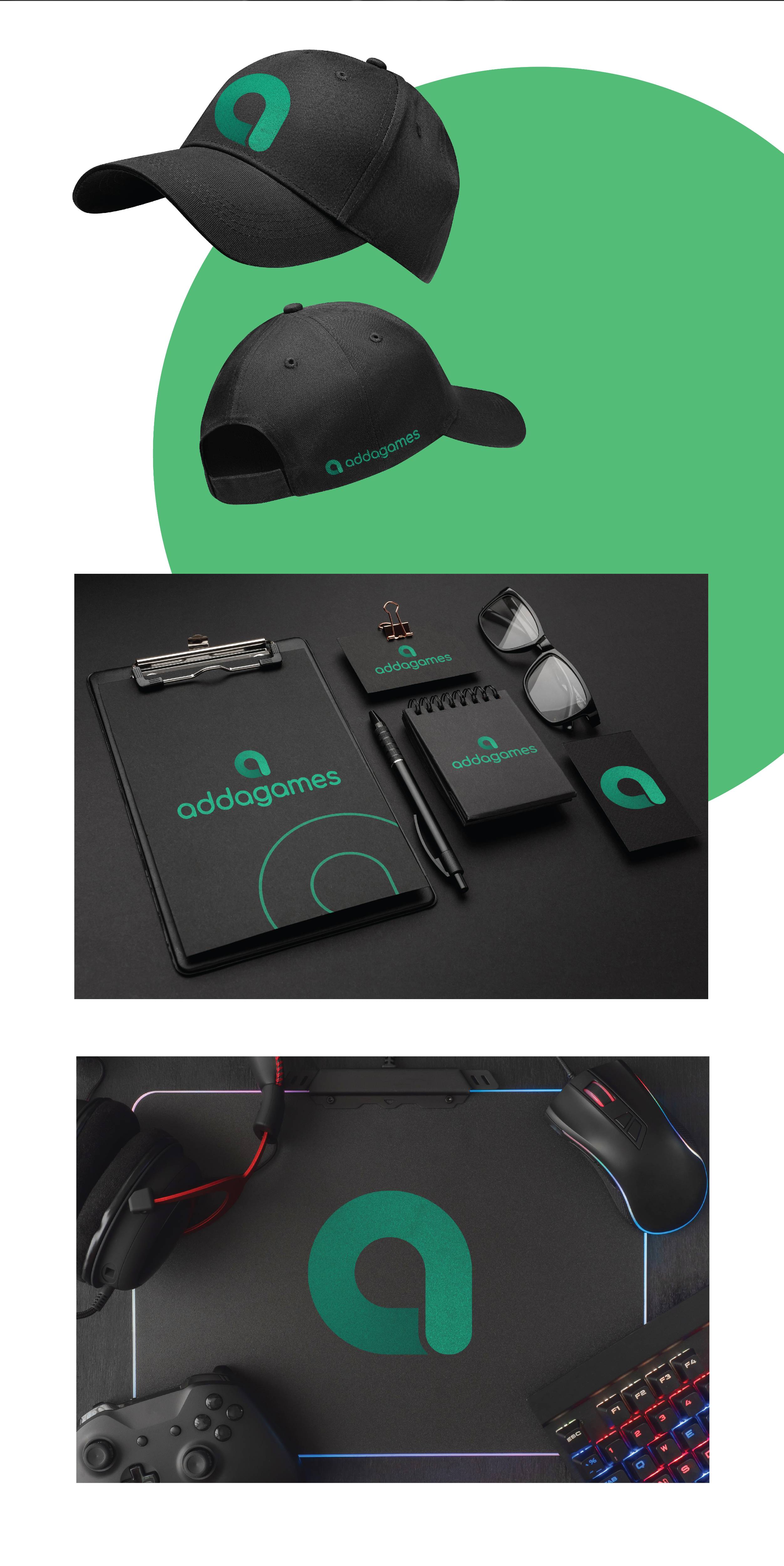
The system on merch · cap, stationery, mousepad